NAICS CODES: 541430, 541490
2022 Federal Report Card Layout and Accessibility
CLIENT
Center for Plain Language
DELIVERABLES
Layout services
Section 508 remediation services
On-call Support
SERVICES
Accessibility
Graphic Design
Brand Strategy

“I am so glad you could provide the 508-compliant version of the report so it could be published yesterday to coincide with the report release.” – Brittany Brown, Center for Plain Language Board Member and 2022 Federal Report Card Lead Judge.
Project Description
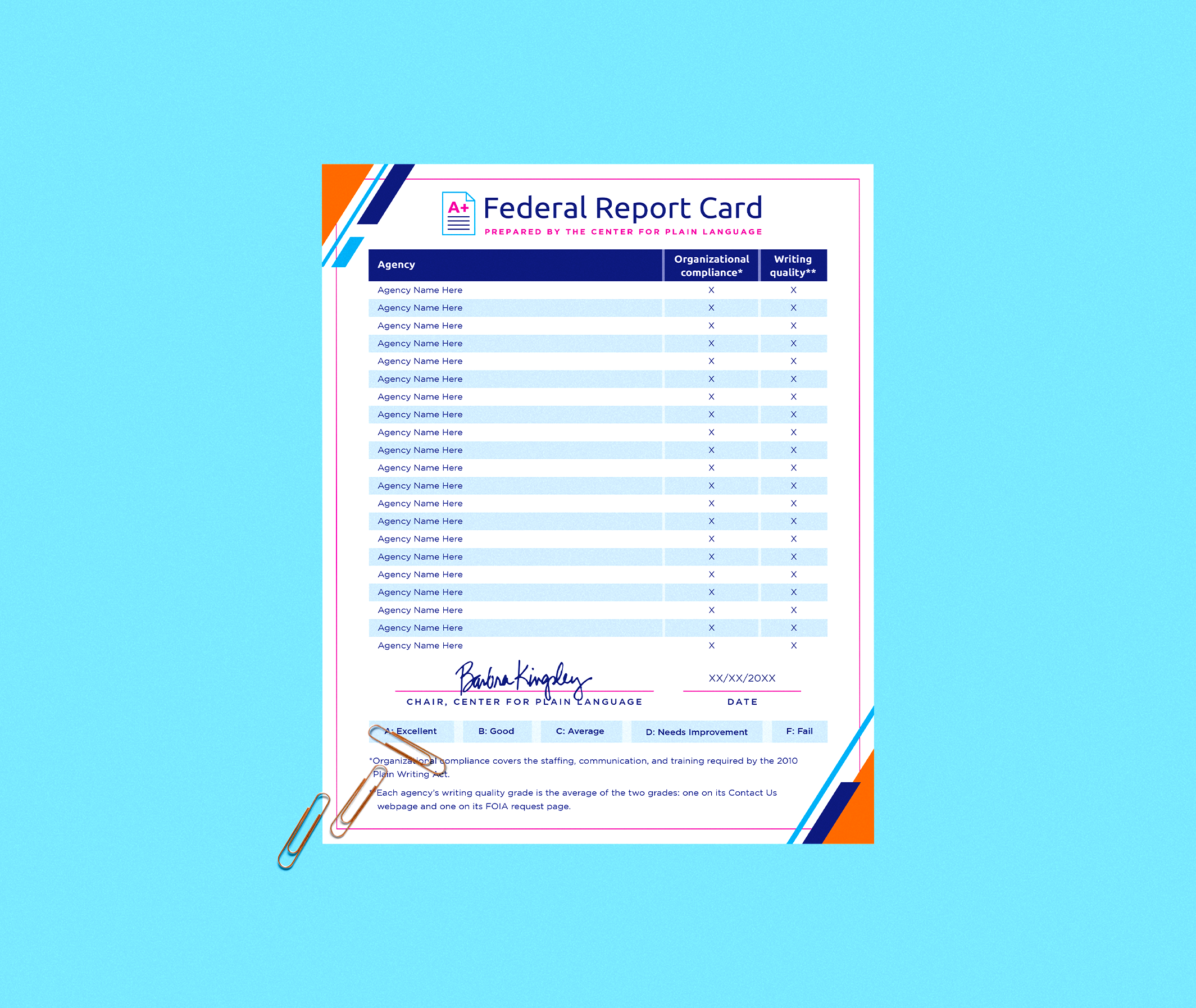
The Center for Plain Language needed support in the design, layout, and Section 508 compliance of its annual Federal Report Card. The 2022 Report Card was the 11th annual evaluation of how well federal agencies follow the Plain Writing Act. The Center evaluated 21 Executive Branch agencies, including all 15 cabinet-level departments. Agencies were scored according to the Center’s grading criteria, which takes into account organizational compliance, writing quality, and the public’s ease of finding information, among other considerations.


The Challenge
The Center had a new template it could use for the Federal Report Card. For the first time in the Report Card’s 11-year history, it would be presented in a colorful and consistently branded document. The Center needed help getting the information formatted and optimized for accessibility, a critical factor in line with Center’s foundation and core purpose. After the grades were correctly formatted in the newly designed and branded document, the Center needed to ensure the document was accessible to everyone by making it Section 508 compliant on its website.
The Solution
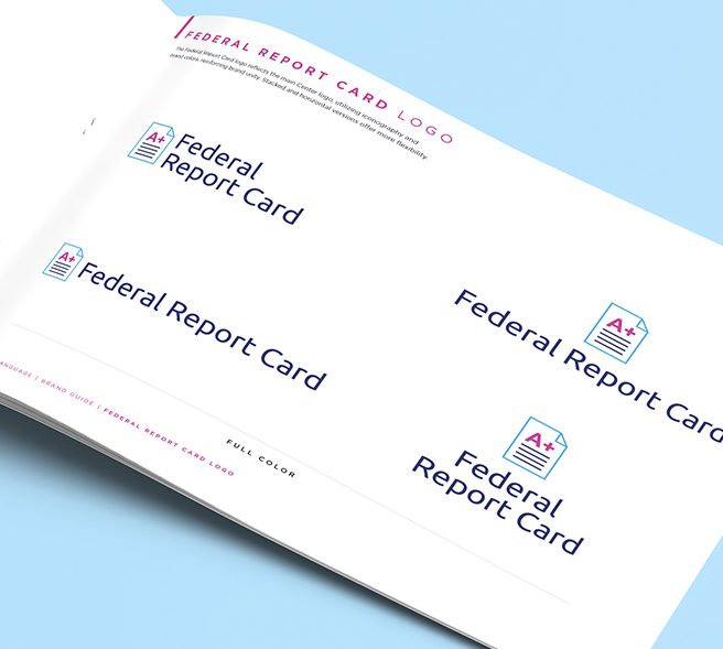
CM reimagined the Center’s logo with an updated color palette and a more modern and graphic-forward arrangement. Our team connected all the products together with consistent colors and style, creating an entirely new branding presence for the Federal Report Card that was both immediately familiar and recognizable while also being interesting, vibrant and approachable. Keeping in mind the Center’s need for scalability and sustainability of the deliverables over time, our team also created “blanks” of certain designs so the Center can fill in new years and titles on their own in free online programs without needing to reach out to us again to make both the small and significant updates they may need over the years to come. We also remain a pro bono social media partner of the Center, so if they ever encounter any issues, we’re just an email or call away from the support they may need.
The Solution
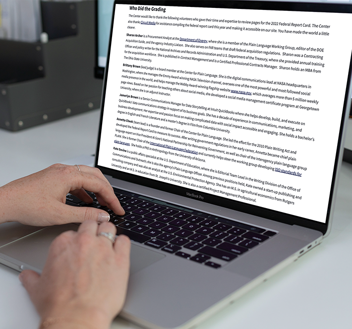
After designing the new template for the Report Card, Circuit Media served as on-call support for this effort with the Center, assisting with layout after the grades were prepared and then remediating the document to be Section 508 compliant within just one business day.

The Solution
CM reimagined the Center’s logo with an updated color palette and a more modern and graphic-forward arrangement. Our team connected all the products together with consistent colors and style, creating an entirely new branding presence for the Federal Report Card that was both immediately familiar and recognizable while also being interesting, vibrant and approachable. Keeping in mind the Center’s need for scalability and sustainability of the deliverables over time, our team also created “blanks” of certain designs so the Center can fill in new years and titles on their own in free online programs without needing to reach out to us again to make both the small and significant updates they may need over the years to come. We also remain a pro bono social media partner of the Center, so if they ever encounter any issues, we’re just an email or call away from the support they may need.

The Result
The Center was able to communicate its annual key findings, grades, and page examples. In addition to the Report Card being accessible to all, the branding work the Circuit Media team did for the Center allowed the Report Card to be presented for the first time in a way that made its brand identity clear, cohesive, and concise, while also being clearly defined as a product of the Center.
The Solution
CM reimagined the Center’s logo with an updated color palette and a more modern and graphic-forward arrangement. Our team connected all the products together with consistent colors and style, creating an entirely new branding presence for the Federal Report Card that was both immediately familiar and recognizable while also being interesting, vibrant and approachable. Keeping in mind the Center’s need for scalability and sustainability of the deliverables over time, our team also created “blanks” of certain designs so the Center can fill in new years and titles on their own in free online programs without needing to reach out to us again to make both the small and significant updates they may need over the years to come. We also remain a pro bono social media partner of the Center, so if they ever encounter any issues, we’re just an email or call away from the support they may need.