NAICS CODES: 541430, 541490
Center for Plain Language Brand Design Services
CLIENT
Center for Plain Language
DELIVERABLES
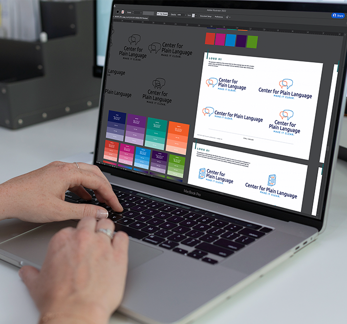
Logo
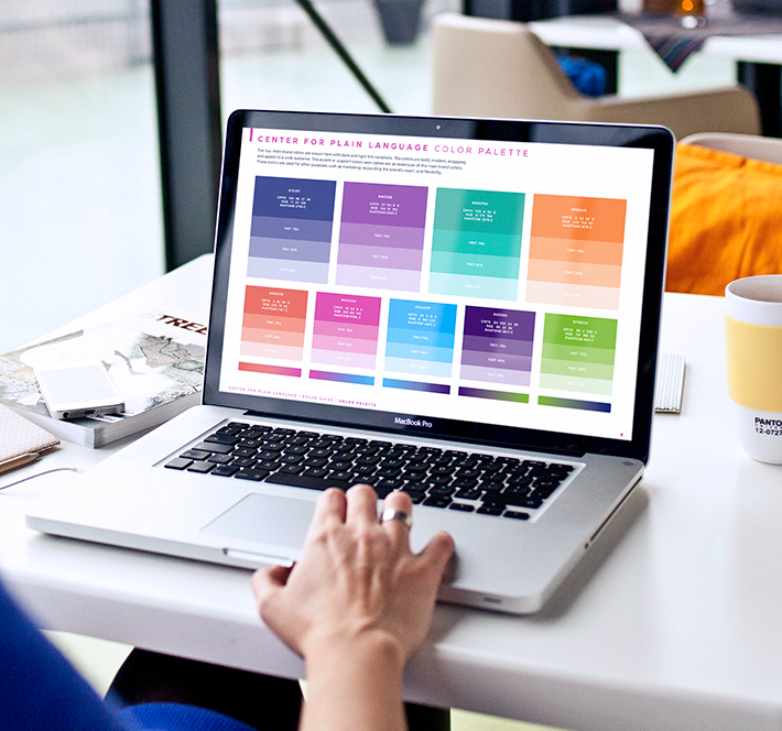
Color Palette
Icon System
Brand Guide
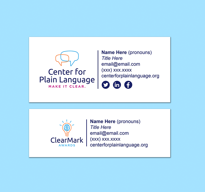
Brand Collateral
SERVICES
Graphic Design
Brand Strategy

“We were all impressed with the level of collaboration and creative work of the Circuit Media team. We now have an entire suite of graphics we are excited about!” – Barbra Kingsley, Chair, Center for Plain Language
Project Description
Circuit Media served as pro bono social media support for more than four years for the Center for Plain Language. After designing two new specialized social media series for the Center, Fix It Fridays and Wisdom Wednesdays, CM was able to grow the Center’s social media presence and increase interaction by significant amounts within the first two months alone. Impressions and profile visits on the Center’s various platforms skyrocketed by roughly 90% on some platforms with an even more dramatic difference on the Center’s most popular social profile — Facebook. After establishing this longtime and trusted partnership with the Center, CM was approached with an ambitious and critical project for this nonprofit. The Center needed to refresh and redesign its branding, including creating some branding from scratch for the Center’s annual Federal Report Card. The nonprofit organization came to us with goals and targets to hit with the new look — specifically, they needed to increase the vibrancy and approachability of their branding while updating the overall look and feel of the existing logos. And they needed to get it all done as quickly as possible — within two months.
Project Goal
Success for this nonprofit included a fresh, approachable and modernized feel for an already established brand dating back nearly 20 years.
The Challenge
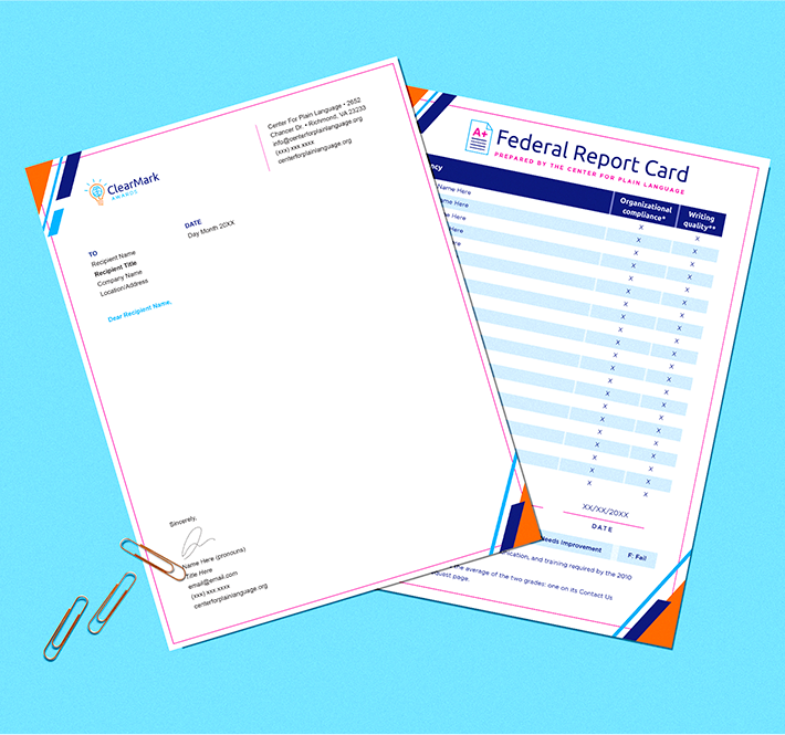
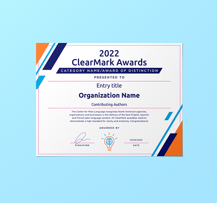
The Center wanted to maintain the familiarity of their branding but needed to refresh the look and increase the approachability of the logos. For the Federal Report Card, they needed to create both product branding and a document design from scratch while also making it apparent it’s tied to the Center. Cohesion across two separate products — the Center’s ClearMark Awards and the Federal Report Card — needed to be achieved with the updated branding color palette. The Center also needed original and high quality files to keep in a central and organized location that was accessible to a larger team for the nonprofit. Over the years, after many copy and pastes, the Center’s primary logo had become grainy and degraded and it was difficult for them to consistently track down the original and high quality files. In addition to all this, what the Center really needed was increased brand flexibility. They needed to be able to update and scale some of the requested design deliverables on their own without expensive and complex design software and without needing to contract with the original designer every time they needed to update a year or title on something.
The Solution
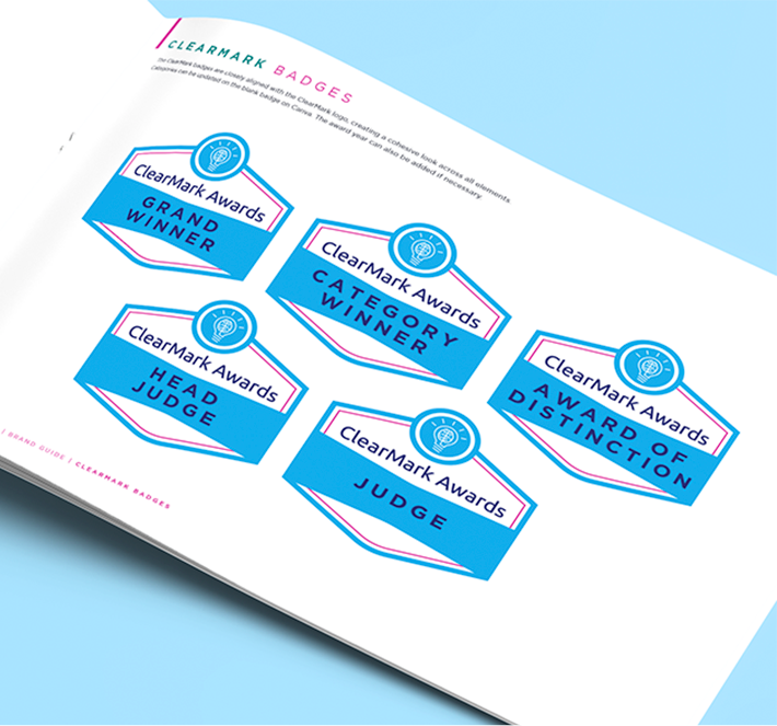
CM reimagined the Center’s logo with an updated color palette and a more modern and graphic-forward arrangement. Our team connected all the products together with consistent colors and style, creating an entirely new branding presence for the Federal Report Card that was both immediately familiar and recognizable while also being interesting, vibrant and approachable. Keeping in mind the Center’s need for scalability and sustainability of the deliverables over time, our team also created “blanks” of certain designs so the Center can fill in new years and titles on their own in free online programs without needing to reach out to us again to make both the small and significant updates they may need over the years to come. We also remain a pro bono social media partner of the Center, so if they ever encounter any issues, we’re just an email or call away from the support they may need.
The Result
The Center is now not only free of what had become a frustrating cycle of trying to copy and paste old files, they’re free to adjust, scale and update designs and marketing materials as needed without needing to retain a portion of their nonprofit budget to contract with a design team every year. The updated color palette and fresh design of the various branding items also allows the Center to target new audiences and further its mission to champion plain language and clear communication.